Healthcare Page Re-design & Atomic design
My role: This was a solo piece that took three weeks to complete, and I kept a tight feedback loop with two senior designers in the company. I did everything in this project including the designing, research and usability test.
A cluttered & confusing layout made it overwhelming and makes it difficult to find the important information
Ambiguous messages that don’t clearly communicate the benefits and science of the weight loss service
The lack of visible trustworthy symbols or certifications raise doubts about the legitimacy of the service
An absence of testimonials, reviews, and success stories from previous clients for trust-building
Insufficient information about the weight loss program leaves users with unanswered questions
Tags: #UI Design #Illustrations & Icons #Re-design #Healthcare
THE SCOPE
Re-designing a mobile friendly landing page for a healthcare startup using brand guidelines. The company was an Australian based startup aimed at helping women lose weight through a self-administered injection.
Due to it being health related, there is a need to invoke trust and confidence in their consumers. They are launching as a new market in the UK so this aspect is very important. The goal of the page is to get the user to take the quiz/assessment to see if the service is suitable and to inform the user about the services and the positive aspects of the services.
THE PROBLEM
The information on the original page was quite ambiguous and hard to see the benefits and information around the science which led to a lot of user drop-offs.
All users would be first-time users, so the experience must be a relationship with trust-building and confidence, and testimonials and reviews are extremely integral. Transparency for credibility purposes seems like the best way to tackle this project. Many women have had negative experiences with other weight loss programs so it is important that they are not sceptical about trying the service.
The fact that the user needs to take a quiz to find out if the weight loss management would be suitable and healthy for them, makes it a pain point. It is integral that the quiz is taken or the user on the page may not be suitable for the service.
Many women struggle to lose weight through exercise and dieting alone, so other ways of losing weight have been highly sought after. This form of weight loss includes support in the way of making sure that users don’t feel isolated: 1:1 time with General Practitioners and the ability for a sense of community by connecting with other women.
THE PROCESS
I looked at competitor analysis and wanted to understand the kind of user that would want to use the weight-loss service. I did some extensive research into the weight-loss industry and its connection with women.
I was given a detailed brief, outlining the brand guidelines of the company with insights into the brand's visual identity and tone. Since the brand was expanding overseas to the United Kingdom, a feeling of professionalism and trust was needed,
A thorough examination of the existing healthcare page followed, revealing a lack of trust and confidence in its current design. This observation prompted the need for a redesign to enhance user perception and engagement.
Recognizing the pivotal role of the Call-to-Action (CTA) in encouraging users to take the assessment or quiz, which was prominently shown. To effectively engage users, complex information was carefully broken down and presented in digestible sections to eliminate ambiguity and misunderstandings. There was also a push for users to sign up to the newsletter so that they could stay up to date with the services.
COMPETITOR ANALYSIS & RESEARCH
Emed:
Uses different shades of green: symbolise health and creates a calming, trustworthy atmosphere
A lot of use of white space creates a minimal and sleek look
Using a black CTA which doesn’t stand out but the green circular gradient behind it highlights it to the user
NHS GP @ Hand:
Colour: blue known for medical industry
Uses a photo of a smiling medical professional to connect with the viewer and welcome
Icons used for visual enhancement and symbolism for each point
A lot of white space for a clean and professional/trustworthy look
One Medical:
Colour: green and blue for health and a calming, trustworthy feeling
Uses high contrast and large fonts for accessibility
Uses dynamic images and colour to engage the user upon entrance
Emed continued:
Uses illustrations and graphics as opposed to photographs
Information hierarchy breaks up the large chunks of information- numbering and titles are used
Icons to visually enhance the complex information
NHS GP @ Hand:
Has information about who has used the service and a 96% satisfaction score- testimonies and reviews help with credentials
“Why choose us” enhances trustworthiness - helps if other users have successfully used it
One Medical continued:
Uses a search facility on the landing page
Engages users with illustrations and snippets of information where you can “learn more”.
Open about their membership costs
Lists companies that partner with them to show the legitimacy
LOFI MOCKUPS
I decided to stick with the greens as it was so popular in health-care-centered pages and helped to keep the user calm and feel trusting. There was a lot of information, so I had to think of different ways of dividing the information such as banners and carousels. I wanted to make sure that the page was visually engaging so I made sure to include space for images and icons throughout.
USER PERSONA
MIDFI MOCKUPS
ITERATIONS
The design process transitioned from low-fidelity sketches, allowing for rapid ideation and exploration of layout options, to mid-fidelity mockups. The mid-fidelity stage involved refining the design, which underwent a thorough review in a collaborative feedback loop with the company.
This iterative process allowed for revisions based on the company's input, ensuring that the designs aligned seamlessly with their vision and goals.
The organization of the design followed atomic design principles, promoting consistency and modularity, which enhanced the overall user experience.
Feedback loop conversations:
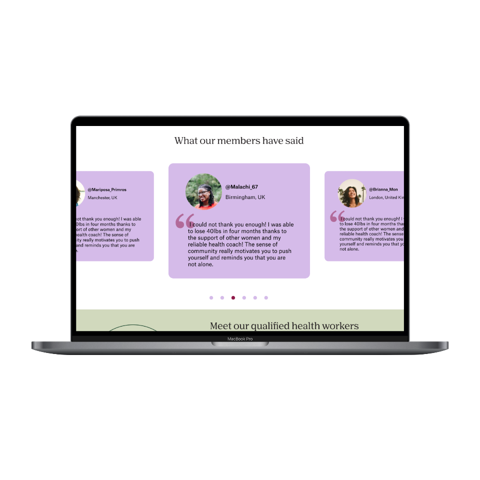
They really appreciated adding testimonials as it added a layer of trustworthiness
Initially, the CTA had been a lilac colour button, but I made it a bright plum colour which was more visually appealing and positioned prominently so that it was impossible to miss
They gave me some more of the science to add to the page to be as informative as possible
I had brought up that there was no transparency over costs so they gave me some information that I could use
Changed a lot about sizing and layout
ATOMIC DESIGN
I structured elements around atomic design principles which enabled me to work faster, add clarity & structure to the project but also allow for easy reusability of elements within the course of the project.
** There is no logo design included to keep the company private which is why it is blank **
SOLUTION
I was able to successfully redesign a mobile & desktop view for the companies new landing page. One that invoked a warm tone for the brand.
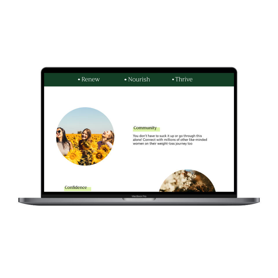
I decided to use a hero image because the woman in the image and mission statement could connect with the user but also portray the brands ethos. The hero image is separated into layer masks of “blobby” shapes which curves give the page a feminine look.
The mint green gives a relaxing, natural and healthy feel
I used symmetry in order to highlight four main points of the brand with different card components that included alternating images and text.
I chose images that had a natural, warm element in it alongside positive imagery of women. which humanizes the experience and encourages trust.
I continued to separate large amounts of tasks taken by the user with spacing, bullet point and subheadings.
I have placed another quote that sits in between two illustrations. In this section, the feel of the website loosens a bit since the page is less intensive as it would have been without visuals and plays on colour.
After the go-ahead from the company, I also included testimonials and information about the different doctors that were available.
OUTCOME
Ultimately, the company expressed satisfaction with the final result. The high-fidelity screens captured the essence of the brand, presented information transparently, and effectively encouraged users to take the desired action, marking the successful completion of the healthcare page redesign.
I think to improve, it would be great to provide clear information about the program's approach, methodologies, and success rates. Maybe it would be helpful to incorporate before-and-after photos or case studies.
I had no chance of doing post-release user testing or feedback as the screens were handed back to the client and developed on their end.
Please click to see the: Scrollable Mobile Screen
PROJECT LEARNINGS
Confidence: Users must feel secure on the new UK page, given the company's new presence there. In order to check eligibility of using the services the user has to go through an assessment that asks personal questions that users should feel comfortable and trusting to take it.
Feedback: I learned about working with a client and keeping a strong feedback loop of critiques and comments. I was able to separate myself and any critiques that they had, and improve the screens until the client was happy with it.
Problem-solving: Developing problem-solving skills by identifying user pain points and proposing creative solutions, such as testimonials and transparency with cost. I understand now that design is a continuous process of solving problems and making improvements.
Please see the final desktop screens below.


